Scroll Down

Franzoni&Co Branding

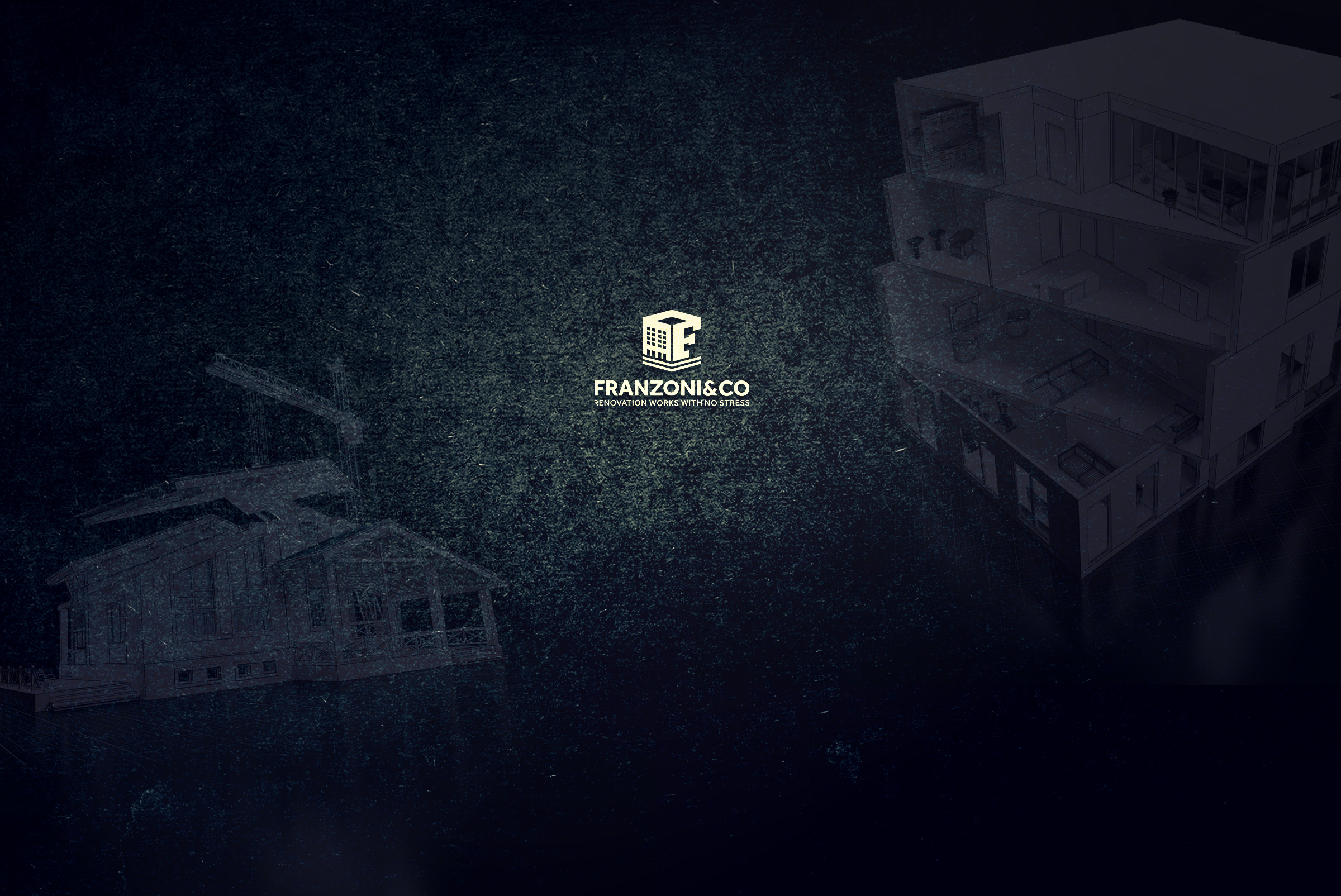
This project included logo design and corporate identity design for construction and renovation company Franzoni&Co. The company is located in Riga and known for many large scale construction and renovation projects. The logotype clearly represents the scope of the company as it incorporates both: the main activity of the company (a building) and letter F, identifying the business name. Company name and slogan “Renovation works with no stress” are placed underneath the logotype symbol.

  • Client: Franzoni&Co
  • Date: 2016/04
  • Country: Latvia
  • Services: Logo Design, Branding
graphic design, craft mark, studio, craft mark studio, logo design, packaging design, print design, copywriting, web design, marketing, social network, corporate identity, professional, branding, freelancer, freelancer designer, freelancer graphic designer, brand strategy, craftmark studio, copywriter, freelance, freelance graphic designer, mark, logo mark, monogram, package design, writing, graphic work, usa, europe, graphic art, business, labels, vape, e-liquid, e-liquid design, e-liquid packaging design, beer, wine, food, whiskey, mark, craft, branding

What is more, we created brand new corporate identity,

complementing the new company logo and including a business card, letterhead and e-mail signature. Selected color scheme is blue with all its shades, representing stability, efficiency and highest quality of work. Business cards and letterhead were created using the same color scheme and elements from the logotype. Whereas e-mail signature includes more graphic elements, in order to represent the company via e-mail in a more vivid and attractive manner. As a last step of the project, the client was also presented with logotype usage guidelines and recommendations.

graphic design, craft mark, studio, craft mark studio, logo design, packaging design, print design, copywriting, web design, marketing, social network, corporate identity, professional, branding, freelancer, freelancer designer, freelancer graphic designer, brand strategy, craftmark studio, copywriter, freelance, freelance graphic designer, mark, logo mark, monogram, package design, writing, graphic work, usa, europe, graphic art, business, labels, vape, e-liquid, e-liquid design, e-liquid packaging design, beer, wine, food, whiskey, mark, craft, branding